Customer Portal: A Deep Dive into the Client Experience
At Arionkoder, we’re committed to delivering a customer experience that is reliable, seamless, and extraordinary. Our team is doing great in this department, but we wanted to take it to the next level. With this challenge in mind, we built a user-facing product—the Customer Portal. This platform improves visibility, streamlines communication, and offers our clients a more efficient way to interact with their projects. The portal is a key part of our strategy to stay ahead of the competition by providing clients with tools that simplify their workflows and reinforce our commitment to their success. Here’s how we took the first steps in building it…

Why build a product for our clients?
In today’s competitive landscape, having an exceptional human interaction experience is crucial, and at Arionkoder, we did this through our great team of tribe leads ( Dedicated customer advocates). However, we believe that technology can further complement and enhance this experience, rather than replace it. The Customer Portal is a testament to our commitment to delivering an A+ experience, with the goal of creating a "wow" effect for our clients.
Solving problems, from the user perspective.
The Customer Portal is a comprehensive digital tool designed to centralize all key information related to our services, offering our customers a clear and accessible overview of their projects. It solves the challenges of fragmented communication and limited visibility by providing a single platform where clients can easily track the progress of their projects, view team allocations, monitor performance metrics, and access relevant documentation.
For this case study, we're using Team Augmentation as an example, as it comes with unique challenges that highlight specific opportunities for improvement. While Team Augmentation is just one of our services, the problems identified within this area provide valuable insights into how we can enhance the customer experience and address similar issues across other service lines.
Team visibility
From the client's perspective, there is a lack of a holistic view of the Arionics working on their projects. Although these team members are deeply integrated and interact with the client's internal teams, the absence of a unified view makes it difficult to fully understand team composition, reallocate them by tech skills, and plan effectively.
Solution: Provide a clear and comprehensive view of the Arionics within the Customer Portal. This includes displaying team roles, PTO information and interaction points with the client's internal teams. By offering this holistic view, the portal enhances the client’s ability to manage and collaborate with their extended team, ensuring better integration and more effective project outcomes.
Fulfillment tracking
Managing the hiring process can be chaotic and fragmented, with key information about open positions, candidate statuses, and the overall health of the hiring pipeline scattered across different tools and systems. This lack of centralized information makes it difficult for teams to stay on top of hiring needs and ensure that positions are filled efficiently.
Solution: Implement a detailed tracking system within the Customer Portal that centralizes all information related to open positions, candidate details and statuses, and the overall health of the hiring pipeline. This system provides a clear, organized view that allows teams to easily monitor progress, identify bottlenecks, and ensure that hiring processes remain on track.
With these two relevant problem spaces identified, we were ready to start working on finding the best solution and building something that also delivers value.
Building the very first version
Inception to Research
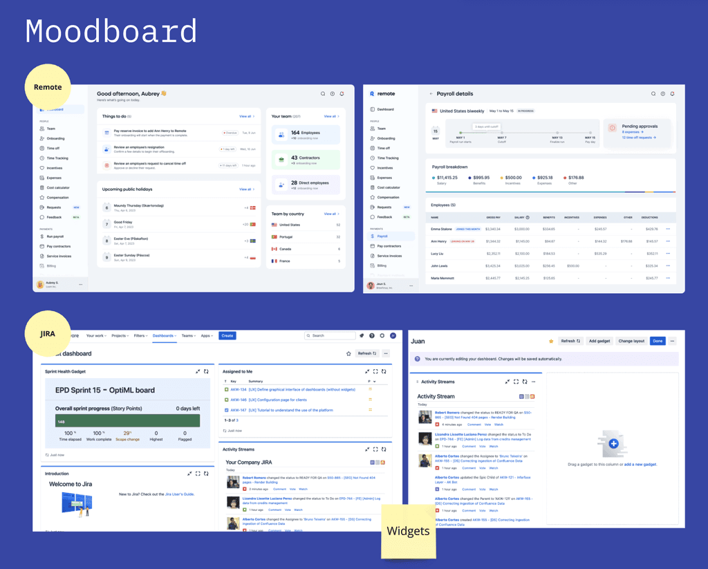
It all began with a thorough inception phase, where our product team conducted extensive research, analyzed market references, and sketched out initial ideas. We explored what competitors were doing and identified opportunities to create a tool that would genuinely add value for our clients. The goal was to ensure that the portal would be intuitive, user-friendly, and aligned with our clients' needs.
Platforms like Remote and Jira were used as references
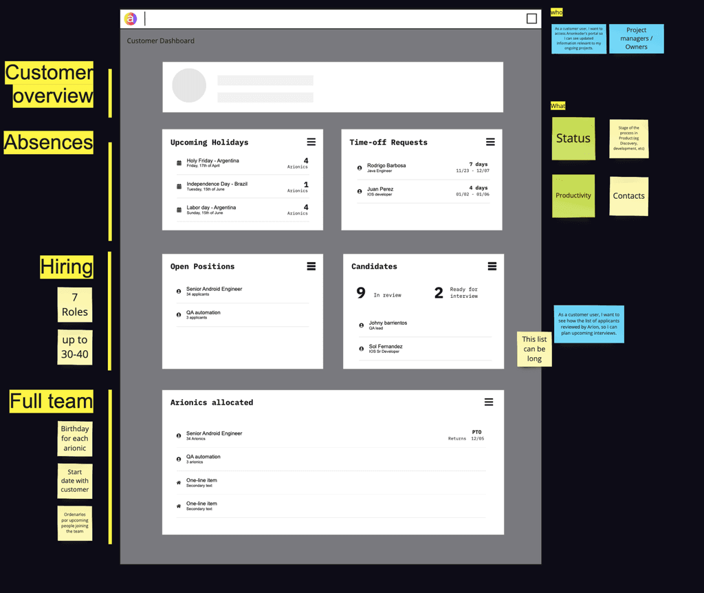
We used a mix of low and medium-fidelity prototypes to test ideas and discuss internally and with the customers
Prototyping and Testing
Next, we moved into the prototyping phase. We created wireframes and prototypes that were then tested with real customers, including some of our key clients. Through this process, we gathered invaluable feedback that informed the design and functionality of the portal. Our research during this phase emphasized the importance of simplicity and ease of use, which became key drivers in the development process.
As we demoed the solution using prototypes, we simultaneously researched to better understand the problems our clients were facing and how the tool could address those issues. It was crucial to assess both the severity and frequency of these problems to ensure our solution would be effective.
Preparing a structured script was crucial for maintaining focus during our sessions and ensuring we captured the feedback we needed. This approach helped us stay on track and avoid sidetracking the conversation. We asked targeted questions like, “Is this information helpful to you or your team? Why?” and “How often do you need to know about upcoming holidays and impacted countries?” to dive deeper into the users' needs and validate the relevance of the information.
The MVP
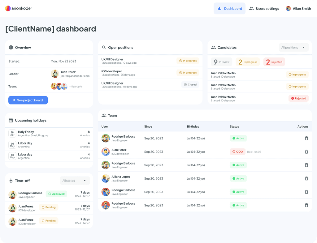
With a solid prototype, our development team set out to build the first Minimum Viable Product (MVP) of the Customer Portal. This initial version focused on core features that addressed some of the most pressing needs of our clients. Throughout the development process, we maintained close collaboration between the design, development, and product management teams to ensure that the final product met our quality standards.
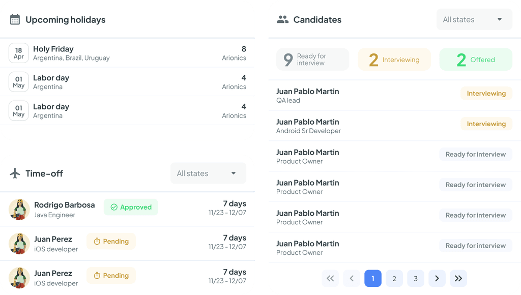
Timeoff visibility and candidates tracking were 2 key widgets of the first iterations
Users’ Feedback: After releasing the first version, we immediately conducted a second round of sessions. We didn’t want to simply launch the product and wait for feedback - we were proactive in gathering insights. Overall, the feedback from our customers was positive. Clients appreciated the enhanced visibility and the convenience of having all critical information centralized in one place. They particularly highlighted the portal’s user-friendliness and how it improved communication between their teams and ours. This positive reception confirmed that we were on the right track and motivated us to continue iterating and improving the portal.
However, not everything went as smoothly as we had hoped. Some widgets generated low interest, and the user experience (UX) faced challenges, among other issues. We collected a lot of feedback, which quickly filled up our backlog. This influx of ideas, improvements, and new feature opportunities was promptly prioritized for further development.
Time for changes: Iteration begins
After the feedback sessions, we decided to prioritize balancing medium-effort feature upgrades with minor UX/UI tweaks in the team's workload.
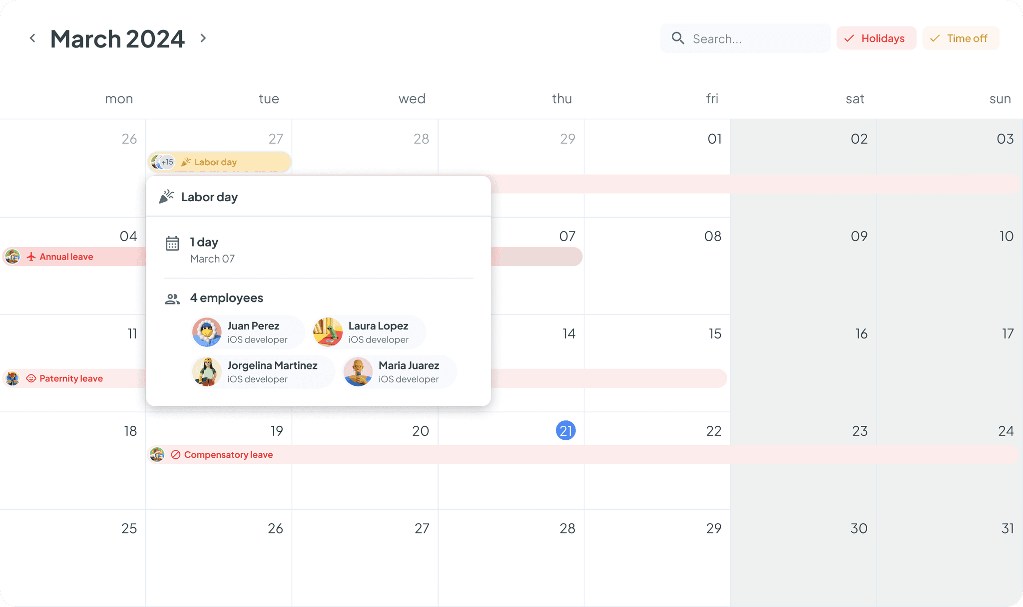
A calendar view for Time Off
The team quickly realized that we needed an additional method to display people's absences. One user mentioned this directly. We had considered including this feature, but it didn't make it to the MVP due to the extra effort required. The team quickly realized that we needed an additional method to display people's absences.
The calendar lets the user see clearly when and who will be out in the next few weeks.
UX tweaks
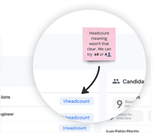
The team took some time to prioritize low-hanging fruits in the UX department. The work consisted of a mix of wording changes, finding alternative icons for some widgets, and adjusting the repositioning of some elements.
The Big Challenge:
Driving Engagement
While developing the Customer Portal, we faced a significant challenge: how to ensure our clients actually use the tool?. The portal is designed to streamline communication and data flow, integrating multiple tools and platforms into a structured and efficient system. However, for this to be successful, we need to capture users' attention and encourage them to log in and utilize the portal, rather than reverting to their old habits.
To overcome this, we recognize that simply replicating existing processes in a new platform isn’t enough. We must add extra value to the information we provide, offering solutions and insights that go beyond what clients are accustomed to. This is critical to making the portal not just an alternative, but a preferred choice.
Additionally, having a robust notification and email strategy is key. By sending well-crafted, digestible event notifications, we can keep clients informed and engaged, gently nudging them towards interaction with the portal. These notifications should not only be timely and relevant but also foster engagement by highlighting the benefits of using the portal over traditional methods.
In essence, our success depends on our ability to make the portal indispensable to our clients—something that not only simplifies their workflows but also enhances them in meaningful ways.
Conclusion
The development of the Customer Portal has been a challenging yet rewarding experience. This first iteration brought its own set of challenges, particularly in ensuring client engagement. We quickly realized that adding real value was crucial to making the portal indispensable.
Through careful iteration and staying close to our clients, we've laid a solid foundation, but this is just the beginning. The portal will soon expand to address other use cases, continuing to evolve based on research and client feedback. Our goal remains clear: to create a platform that simplifies processes, fosters collaboration, and becomes an essential tool for our clients’ success.
